B. Drama / D. Visual Arts · Drama and Visual ArtsVisual Arts: Motifs, Fonts and Printmaking Texture
D1.3 D1.4 D2.3About 50 minutes
Learning goals- I can create a motif and repeat it to make a pattern.
- I can choose and design fonts that match a message.
- I can make a relief print and create textures with different marks.
- I can read the meaning of motifs, symbols and fonts in art works.
Words to know
motif
A design element (a shape, symbol or picture) that is repeated in an art work.
pattern
A design made by repeating motifs, lines, shapes or colours in a regular way.
font
A style of lettering, such as a plain, a fancy or a bold style.
relief print
A print made from a surface where the raised parts take the ink and print, and the cut-away parts stay blank.
printing block
The surface you carve or press into, ink and print from.
brayer
A small roller used to spread ink evenly on a printing block.
edition
A set of identical prints made from the same block.
texture
How a surface feels or looks like it would feel: rough, smooth, bumpy and so on.
Remember from Grade 5
You designed a poster with symmetrical and asymmetrical lettering, used texture tools like sponges and forks, and read signs and symbols.
In Grade 6 you will design your own motif, choose fonts that send a message, and make a relief print with many textures.
The same leaf, again and again
Look at a hockey jersey, a quilt, wallpaper or the beadwork on a pair of moccasins. Often you'll see one small design, like a leaf, a star or a flower, repeated over and over. That small design is a motif. Repeat it, and it becomes a pattern.
Printing is one of the easiest ways to repeat a motif: carve it once, and you can print it many times.
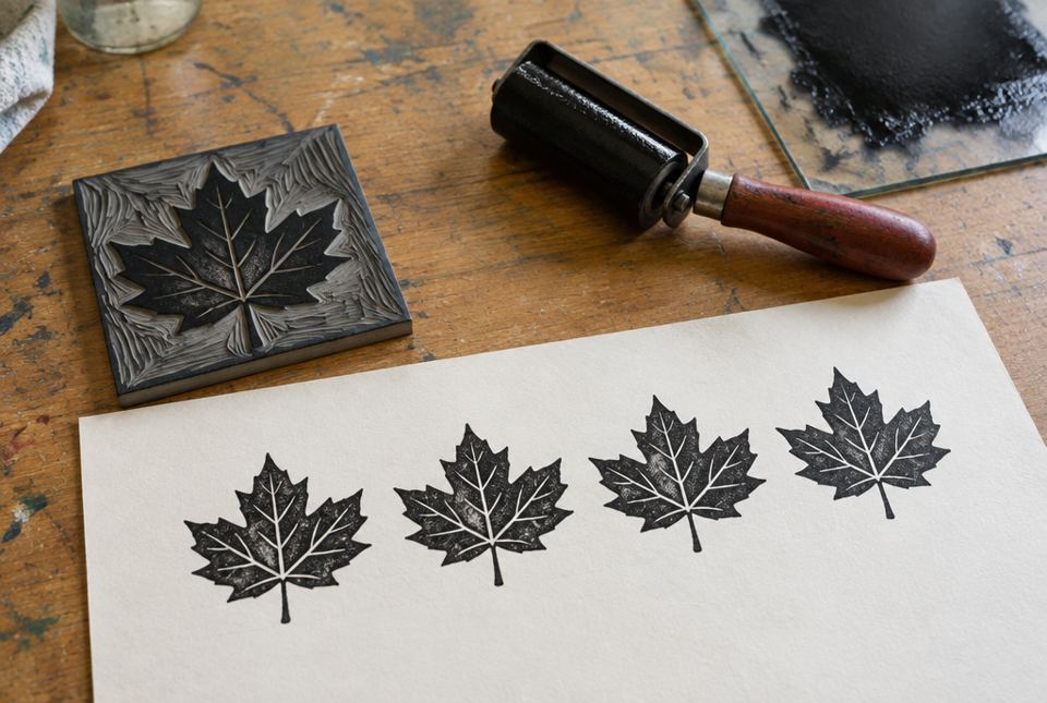 The leaf motif was carved once but can be printed again and again to make a pattern. AI-generated imageA pattern made from one leaf motif repeated in two rows, with small circles between the rows.
Motifs carry meaning
A motif isn't just decoration. It can be a symbol:
- A maple leaf is a symbol of Canada.
- A poppy is a symbol of remembrance in Canada, worn around Remembrance Day.
- A heart can mean love; a dove can mean peace.
- In Métis art, colourful floral (flower) beadwork motifs are well known; the Métis have been called the "Flower Beadwork People."
Some motifs in First Nations, Métis and Inuit art have special meanings for a family, a Nation or a ceremony, and are not meant to be copied. It's respectful to create your own motifs from your own life, and to learn about others' motifs from the artists and communities who make them.
Fonts send messages too
The style of lettering changes how words feel:
- Plain, simple letters (like most signs): clear, modern, easy to read.
- Letters with little "feet" (like many books): traditional, serious.
- Script (joined, like handwriting): elegant, friendly, personal.
- Decorative letters: fun, spooky, wintry, sporty... For example, letters made of icicles for a winter carnival, or dripping letters for a haunted house.
- Exaggerated letters, like huge bold capitals or letters that get bigger and bigger, can shout, show excitement or show movement.
Ask: Does my font match my message? Can people read it?
Relief printing
In a relief print, the raised parts of the block take the ink and print. The parts you cut or press away stay blank (the colour of the paper).
Artists make relief blocks from wood, linoleum, softoleum (a soft carving block), or even rubber or foam. In school, softoleum is carved with sharp tools called gouges: a V-gouge makes thin, sharp lines and a U-gouge scoops wider areas. Gouges are sharp, so they are used only with a teacher or grown-up supervising, always cutting away from your body. At home, you can make a safe relief print by pressing into a sheet of foam with a dull pencil.
Important: a print comes out backwards (a mirror image)! Letters and numbers must be carved backwards on the block to print the right way.
Textures in a print
The marks you make on the block become textures in the print:
- thin parallel lines → fur, grass, rain
- crossing lines (cross-hatching) → darker areas, woven fabric
- dots → sand, snow, stars, freckles
- short curved marks → feathers, scales, waves
- leaving a large area un-carved → a solid shape of ink
The Inuk artist Kenojuak Ashevak of Kinngait (Cape Dorset), Nunavut, became famous for her prints. Her print The Enchanted Owl (1960) shows an owl with feathers spreading out in bold, patterned shapes, and it appeared on a Canadian postage stamp. Artists in Kinngait continue to make prints today, and a new collection of their prints is released each year.
Worked exampleExample: Designing a motif and a font for a winter carnival poster
Your school is holding a winter carnival. Let's design a motif and lettering for the poster.
- Brainstorm symbols of winter fun: a snowflake, a toboggan, a mitten, a skate.
- Simplify one into a motif: a mitten with a zigzag cuff. Simple shapes print and repeat well.
- Repeat it in a border around the poster: mitten, snowflake, mitten, snowflake (a pattern).
- Font: chunky, rounded letters with icicles hanging from the bottoms. They feel wintry and fun.
- Readability check: step back three metres. Can you still read "WINTER CARNIVAL"? If not, make the letters bolder and the icicles smaller.
- Explain it: "My mitten motif repeated in a pattern says winter fun, and my icicle font matches the theme while staying readable."
A simple, meaningful motif, repeated in a pattern, plus a font that matches the message, makes a strong design.
Worked exampleExample: Making a foam relief print
Let's print a fox motif with fur texture.
- Draw your fox on paper the same size as your foam sheet. If you want words, write them backwards.
- Transfer: lay the paper on the foam and trace firmly with a dull pencil, so the lines press in.
- Deepen and add texture: remove the paper. Press the lines deeper. Add fur with short parallel lines, a dotted snowy background, and leave the fox's body mostly smooth so it prints solid.
- Ink: roll washable paint or water-based block-printing ink thinly and evenly over the foam with a brayer (or dab it on with a sponge).
- Print: lay paper on top and rub all over with your palm or the back of a spoon. Peel slowly.
- Look: the pressed lines are white and the raised areas are coloured, and the fox faces the other way from your drawing!
- Make an edition: re-ink and print three more. Try different colours of paper.
Pressed-in marks print as white lines and textures; raised areas print as colour; and the whole image is reversed.
Riddle timeWhen is writing backwards the right thing to do?
When you are carving letters into a relief print block, so they print the right way around! 🔄
Hands-on activityPrint a pattern
You need: a clean sheet of craft foam or a clean foam take-out lid or tray (washed with soap and water, flat part cut out by a grown-up), a dull pencil or a capped pen, washable paint or water-based block-printing ink, a brayer, a small paint roller or a sponge, a plate or tray for rolling ink, paper, and a spoon.
- Design a motif about something in your life (a pet, a favourite food, a sport, a plant in your yard). Keep it simple, about the size of your palm.
- Add your initial to the motif. Remember to draw it backwards on the block!
- Press the design into the foam with at least three different textures (lines, dots, cross-hatching, curves).
- Print your motif several times on one sheet to make a pattern (a row, a grid or a border). Try rotating it each time.
- Lettering: design a word to go with your print (your name or a message) in a font that matches the feeling of your motif.
- Explain it: what does your motif mean to you? Which textures did you use, and what do they show?
Your turn
A design element (shape, symbol or picture) that is repeated in an art work.
2In a relief print, which parts print: the raised parts or the cut-away parts?
The raised parts take the ink and print. Cut-away parts stay blank.
3Why must letters be carved backwards on a printing block?
Because a print comes out as a mirror image, so backwards letters print the right way.
4What texture could short parallel lines create in a print?
5Describe a font that would suit a poster for a Halloween haunted house.
Example: spooky, dripping or jagged letters, maybe uneven and shaky. It should still be readable.
6Why is it respectful to create your own motifs rather than copy sacred designs from another culture?
Some motifs have special meanings for a family, Nation or ceremony and are not meant to be copied. Creating your own shows respect and makes your art personal.
7Who was Kenojuak Ashevak?
An Inuk artist from Kinngait (Cape Dorset), Nunavut, famous for prints such as The Enchanted Owl.
More practice: warm-up
1What tool is used to roll ink evenly onto a block?
A brayer (a small roller).
2What is a set of identical prints from one block called?
3Is a poppy a symbol of remembrance in Canada?
4What do we call a style of lettering?
5Name one safety rule for carving with gouges.
Use them only with a grown-up supervising, and always cut away from your body (keep your other hand behind the blade).
More practice: on your own
1You carve your name the right way around on a block and print it. What happens, and how do you fix it?
Your name prints backwards (mirror image). Fix: carve it backwards on the block. (Tip: write it on thin paper, flip it over and trace it.)
2Choose a motif to represent your family and explain its meaning.
Example: a canoe with four paddles, because our family goes canoeing every summer and works together. Look for a clear, simple motif with a personal meaning.
3Compare how a plain bold font and a fancy script font would change the feeling of a sign that says "Welcome."
Plain bold: clear, modern, maybe like a public building; easy to read from far. Script: warm, personal and elegant, like a handwritten note, but harder to read at a distance.
4How could you make the background of a print look snowy?
Press many small dots into the background of the block. They print as white specks on coloured ink, like falling snow.
5What can a repeated maple leaf motif tell a viewer about an art work?
It is a symbol of Canada, so it can suggest the art is about Canada, Canadian pride, or fall in Canada.
Challenge
1Plan a two-colour print of a pattern for a community celebration (for example, a Franco-Ontarian Day or a winter festival). Describe your motif, its meaning, your textures and your font.
Example for Franco-Ontarian Day (September 25): a trillium and lily motif inspired by the Franco-Ontarian flag, repeated in a grid in green ink on white paper, with fine parallel lines in the petals; the word "Bonjour!" carved backwards in rounded, friendly letters. The motif symbolizes Franco-Ontarian pride. Look for meaning, textures and a matching font.
2Kenojuak Ashevak's The Enchanted Owl has feathers spreading out in bold patterned shapes. What might the viewer feel or think, and why might an artist use pattern this way?
The spreading, patterned feathers can feel magical, proud or full of life, and the owl may seem larger than a real owl, like a powerful spirit. Pattern creates rhythm and draws the eye around the shape, making a simple image feel rich and memorable. (Accept reasoned interpretations.)
3Why do printmakers often make an edition of prints instead of just one?
Printing lets them make many identical copies so more people can own, share or see the art (for example, posters, cards or collections). It's a way to share art widely, like Kinngait's yearly print collections.
Quiz
2. In a relief print, the parts you press or cut away ___.
3. A print of a word carved the normal way will come out ___.
4. Which font best suits a winter carnival poster?
5. Dots pressed into a printing block can create a texture like ___.
6. Kenojuak Ashevak was famous for ___.
Big idea: For Grade 6, the curriculum's focus for shape and form includes motifs and fonts (along with exaggerated proportions), and for texture, textures created with a variety of tools, materials and techniques (for example, gouged marks in a softoleum print). Students use elements of design to communicate (D1.3), use a variety of materials, tools and techniques to solve design challenges (D1.4) and read and interpret signs, symbols and style (D2.3).
How to help:
- Look for motifs and patterns around the home: quilts, dishes, clothing, gift wrap.
- Compare fonts on cereal boxes, store signs and posters: "What feeling does this lettering give?"
- Look up Kenojuak Ashevak's The Enchanted Owl online together.
Safety: at home, use the foam printing method, with a dull pencil. If foam trays are used, wash them first and an adult should cut them. Carving gouges are sharp and are used only with supervision at school. Use washable paint or water-based block-printing ink (not oil-based ink, which needs solvents to clean up) and cover the table.
Common difficulties:
- Backwards letters. Write the word on thin paper, flip it over and trace it onto the block.
- Lines too shallow to print. Press more firmly, or go over the lines twice.
- Too much ink (fills the lines). Roll a thin, even layer.
- Copying sacred or cultural designs. Encourage personal motifs instead.