B. Drama / D. Visual Arts · Drama and Visual ArtsVisual Arts: Monochrome, Colour Intensity and Value
D1.3 D2.1 D2.2About 45 minutes
Learning goals- I can make a monochromatic painting using one colour with its tints and shades.
- I can mix shades and arrange them in a value scale.
- I can tell bright, intense colours from dull, subdued colours.
- I can use advancing colours and value contrast to make part of my art stand out.
- I can explain the feelings and ideas that colour choices communicate in an art work.
Words to know
hue
The name of a colour, like red, blue or yellow.
monochromatic
Using only one hue, with its tints and shades. ("Mono" means one; "chroma" means colour.)
value
How light or dark a colour is.
shade
A colour made darker by adding black.
tint
A colour made lighter by adding white.
intensity
How bright (intense) or dull (subdued) a colour is.
subdued
Dull, soft or greyish; not bright.
advancing colour
A colour that seems to come toward you, usually a warm, bright, intense colour like red, orange or yellow.
contrast
A big difference, like very light next to very dark.
Remember from Grade 3
You learned about warm and cool colours, and you made tints (adding white) and shades (adding black). In Grade 4, you'll paint with just one colour, mix a whole value scale, and learn how bright and dull colours can push parts of a picture forward or back.
The one-colour challenge
Could you paint a whole picture with just blue? It sounds impossible, but add white and you get sky blue, add more and you get the palest ice blue. Add black and you get navy, then a deep midnight blue.
Suddenly one colour becomes many. A painting made from one hue and its tints and shades is called monochromatic.
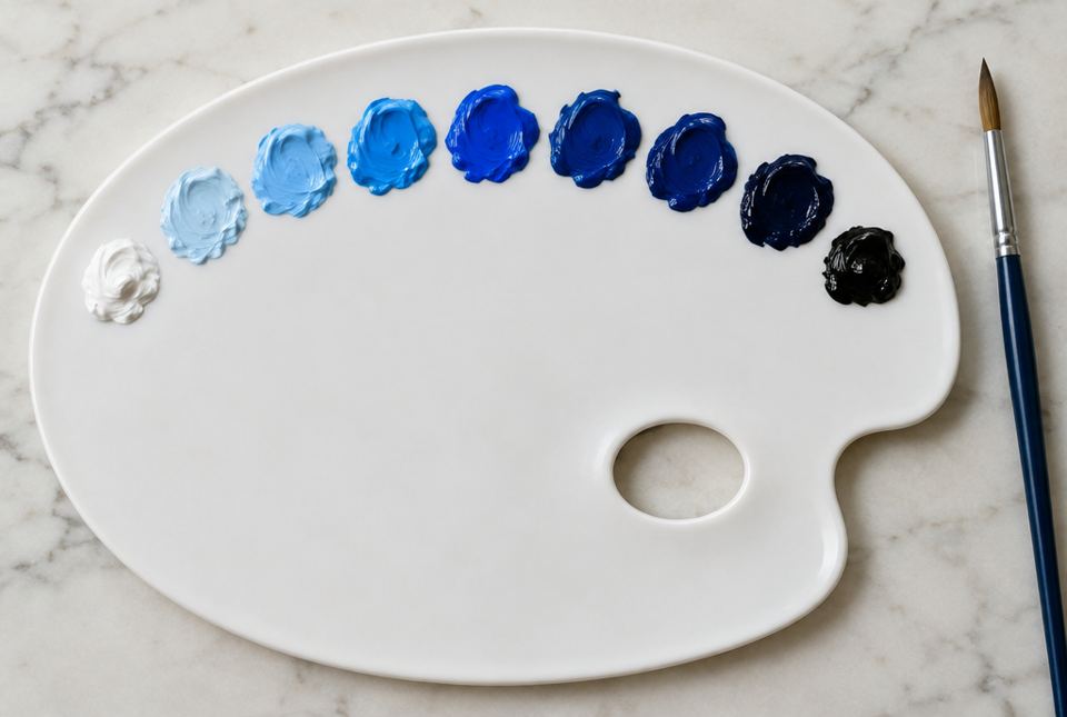 One hue makes many colours! Adding white makes tints and adding black makes shades, from light to dark, like a value scale. AI-generated imageA monochromatic value scale in blue: three tints that get lighter to the left, the pure colour in the middle, and three shades that get darker to the right.
Value: light to dark
Value is how light or dark a colour is. A value scale lines up the values in order, from lightest to darkest.
To mix shades, start with your colour and add a tiny bit of black at a time. Black is very strong! Too much at once turns everything almost black.
To mix tints, start with white and add a little colour at a time.
Value contrast (very light next to very dark) makes things stand out. A pale moon on a dark night sky jumps out at you.
Intensity: bright or dull?
Intensity is how bright or dull a colour is.
- Intense colours are bright and strong, straight from the tube: fire-truck red, bright orange, lemon yellow.
- Subdued colours are dull and soft: brick red, olive green, grey-blue.
To make a colour more subdued, mix in a little grey, or a tiny bit of its opposite colour on the colour wheel (red and green are opposites, blue and orange, yellow and purple).
When you put a bright colour next to subdued colours, the bright one pops. That's called colour emphasis.
| Colour choice | How it seems | Example |
|---|
| warm, bright, intense (red, orange, yellow) | advances: seems to come toward you | a red canoe on a grey lake seems close and important |
| cool, dull, pale (grey-blue, soft green) | seems to sit back in the distance | faraway hills painted soft grey-blue |
| very light next to very dark (value contrast) | stands out strongly | a white snowy owl against a dark forest |
| one hue only (monochromatic) | unified and calm, or with a strong single mood | a whole painting in blues can feel sad, cold or peaceful |
Colour sends feelings and messages
Between about 1901 and 1904, the Spanish artist Pablo Picasso painted mostly in blues and blue-greens. This time is called his Blue Period. One famous painting, The Old Guitarist, shows a thin, old, blind man playing a guitar, painted almost all in shades of blue.
The monochromatic blues make the painting feel cold, quiet and sad. Many people think it shows Picasso's concern for people who were poor and lonely. Colour can carry a social concern, not just a feeling!
Just for funWhat did the blue paint say after a drop of white was mixed in?
"I'm feeling a lot lighter today!" (That's a tint.)
Worked exampleExample: Mixing a monochromatic value scale
Let's mix a seven-step value scale in green.
- Draw seven boxes in a row. The middle box (box 4) gets pure green.
- Tints: in box 3, mix white with a little green. Box 2: more white. Box 1: mostly white with a touch of green (the lightest).
- Shades: in box 5, add a tiny dot of black to green. Box 6: a little more black. Box 7: more black again (the darkest).
- Check: squint at your scale. Do the boxes go smoothly from light to dark, with no big jumps? If two boxes look the same, adjust one.
- Now you have seven greens to paint a whole monochromatic picture: maybe a forest, from pale mist to deep shadows.
A value scale shows tints, the pure colour and shades in order from light to dark. Add black a little at a time.
Worked exampleExample: Using intensity and value to make something stand out
You're painting a fox in a winter forest. You want the fox to be the first thing people see.
- Paint the forest in subdued, cool colours: grey-blue snow, dull brown-grey trees.
- Paint the fox in intense, warm orange. Bright, warm orange is an advancing colour, so it seems to jump forward.
- Add value contrast: put a dark tree trunk right behind the fox's bright head.
- Explain it: "I used an advancing, intense orange for the fox next to subdued colours and a dark background, so the fox stands out."
Intensity, advancing colour and value contrast all pull the viewer's eye to the fox.
Hands-on activityMonochromatic painting
You need: washable paint in one colour you like, plus white and black, a paintbrush, a cup of water, a paper towel, a plate or lid for mixing, and paper.
- Mix a value scale of at least five steps on a strip of paper (see the example). Label the tints, pure colour and shades.
- Choose a subject that matters to you: your street at night, a winter tree, a pet sleeping, a lake at sunrise.
- Lightly sketch it with a pencil.
- Paint it using only your one colour, its tints and its shades. Use your darkest shade next to your lightest tint where you want the most attention (value contrast).
- Step back and squint. Is there a light area, a middle area and a dark area?
- Write one sentence: "My monochromatic painting feels ___ because ___."
Bonus: paint a small second picture with subdued colours everywhere except one bright, intense object.
Your turn
1What does monochromatic mean?
Using only one hue (colour) with its tints and shades.
Add black to a colour (a little at a time).
How light or dark a colour is.
4Which is more intense: fire-truck red or brick red?
Fire-truck red (it's brighter).
5Name a colour that usually advances (seems to come forward).
A warm, bright colour like red, orange or yellow.
6How can you make a bright colour more subdued?
Mix in a little grey, or a tiny bit of its opposite colour on the colour wheel.
7Why does a white snowy owl stand out against a dark forest?
Because of value contrast: very light next to very dark.
More practice: warm-up
Add white (start with white and add a little colour).
3True or false: Black is very strong, so add it a tiny bit at a time.
4What word means dull or soft (not bright)?
5Put in order from light to dark: navy blue, sky blue, pure blue.
Sky blue, pure blue, navy blue.
More practice: on your own
1Why might an artist paint faraway mountains in pale, subdued blue-grey?
Pale, dull, cool colours seem to sit back, so the mountains look far away. (Faraway hills often look hazy and bluish in real life too.)
2A monochromatic painting is all in yellows, from pale cream to dark mustard. What mood might it have? Explain.
Example: warm, sunny, cheerful or calm, because yellow is a warm colour and using one hue makes the painting feel unified. Other answers with a reason are fine.
3Your painting of a red cardinal on a branch doesn't stand out. Give two colour fixes.
Examples: make the cardinal a more intense red; paint the background in subdued colours (grey, dull green); put dark or light values behind it for value contrast.
4How does Picasso's The Old Guitarist use colour to communicate feeling?
He painted it almost all in blues (monochromatic), which feel cold, quiet and sad, matching the lonely old man. It may show concern for poor people.
5Make a value scale in your head: list five values of red from lightest to darkest, with names.
Example: pale pink (tint), pink (tint), pure red, dark red (shade), deep maroon (darkest shade).
Challenge
1Plan a monochromatic picture that shows loneliness and one that shows joy. Choose a hue for each and explain.
Example: loneliness: grey-blues and dark navy shades, an empty bench in snow at night, because cool, dark values feel cold and quiet. Joy: bright oranges and tints of peach, a sunrise over a lake, because warm, light values feel warm and happy. Look for a hue, values and reasons.
2Explain why a red canoe on a grey lake seems closer than it really is.
Red is a warm, intense, advancing colour, and grey is subdued and seems to sit back. The red canoe contrasts with the grey, so it jumps forward and catches the eye.
3An artist wants viewers to notice a social concern, like litter in a park. How could colour help? Give a plan.
Example: paint the park in subdued, soft colours and the litter in intense, bright colours (or strong value contrast) so the litter stands out and viewers notice the problem. Look for using intensity or value to draw attention to the concern.
Quiz
1. A painting using only one hue with its tints and shades is ___.
2. To make a shade, add ___.
4. Which colour is most likely to advance (seem closer)?
5. A bright yellow flower among dull grey-green leaves stands out because of its ___.
6. Picasso's Blue Period paintings mostly feel ___.
Big idea: Grade 4 colour includes a monochromatic colour scheme, colour emphasis through variations in intensity (subdued colours next to bright, intense colours) and advancing colour. Value includes mixing of shades and variations in value to create emphasis (contrast in values). Students use these to communicate (D1.3), interpret the feelings, themes and social concerns in art works (D2.1), and explain how elements create meaning (D2.2).
How to help:
- Paint-chip strips from a hardware store are ready-made value scales. Line them up light to dark.
- Look at Picasso's The Old Guitarist online together and talk about the feeling. Ask, "What do you think the artist cared about?"
- In nature, look for advancing colours: a red cardinal or a bright orange maple leaf against grey sky or snow.
Safety: use washable, non-toxic paint. Cover the table.
Common difficulties:
- Adding too much black. Use a toothpick or the tip of a brush to add black; you can always add more.
- Confusing intensity with value. Value = light/dark; intensity = bright/dull. A pale pink can be light but still clear and bright, and a brick red can be dull but not very dark.
- Muddy colours. Rinse the brush between mixes and use a clean spot on the palette.